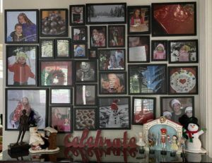
Every three months, I take down the thirty frames in my seasonal wall gallery and swap out my photos. It’s easy to do since I keep all four photos stacked in each frame (one for each season). Seeing my favorite photos refreshed each season is fun since it reflects the traditions and activities our family enjoys during that time of year. Would you like to know how? The tutorial is below or may be found in a printable PDF here.
Step 1: Decide on your four seasonal timeframes.
Seasonal time frame. It depends on where you live. To illustrate, let’s think about the season of winter. To me, winter photos are full of snow and Christmas and baking and red/green. And, since I find that Thanksgiving photos are more fall in color, and in Oregon it doesn’t snow much until December, I decided to make “winter” the months of December, January and February. With that decision made, I progressed three months at a time from there.
- Winter: December, January, February (Christmas, Santa hats, holiday décor, snow, red/green)
- Spring: March, April, May (blossoms, Easter, green, rainbows, umbrellas, kites, tree climbing)
- Summer: June, July, August (swimming, ice cream, fireworks, sunglasses, water balloons)
- Fall: September, October, November (orange/gold leaves, bus, carnival, costumes, Thanksgiving)
Step 2: Design your wall gallery layout.
Find a large, blank wall; mine is in my front entry. The usable space of my wall is approximately 4’ tall x 6’ wide. Begin your measurements approximately 8” above your horizontal barrier: the buffet, the mantle, the chair rail, the sofa, etc.
- With your height/length measurements, draw out your rectangle on graph paper using four grid squares for each foot.
- Grab your tape measure and head to Michael’s or IKEA to choose your frame. I found the quality at Michael’s superior to IKEA. And, with a coupon, the pricing is comparable. I chose their Signature Collection with the glossy, black wood frame. Be sure to choose a frame style with a variety of sizes (from 5×5 to 16×20) AND a common frame color to unify the wall while keeping the focus on your photos.
- Decide whether you want to mat your photos. I have done it both ways, and I prefer without mats to allow the photo sizes to be larger overall. However, mats look nice and allow you to change the actual size of the photo, if desired. For example, you could put a square photo in a rectangle frame with a mat. You couldn’t do that without a mat—a square frame must contain a square photo when not using a mat.
- Begin laying out frames on the floor or on the store’s frame counter. You will begin to see the benefit to choosing many large photo sizes. Even with a few 4’x6’ rectangle frames, I still ended up with 30 frames total which increases the overall cost.
- Consider buying a few extra sizes if you aren’t sure of your layout at the store. I ended up returning three frames without a problem after finalizing my configuration at home with my photos.
- Once you get home, lay a blanket on top of your dining table or on the floor to match the exact size of your wall rectangle space. Place the frames on top of the blanket as you want them to appear on your wall.
Tips for achieving a pleasing layout:
- Mix up portrait and landscape and square orientation.
- Pair large and small.
- Don’t put all the large photos on one side and small frames on the right. Keep it balanced.
- Arrange from the center out with similar spacing between the frames. The gap between the frames should look consistent…notice I didn’t say precisely the same separation. The overall impression of the gaps should be similar for a pleasing ensemble.
- Anchor the corners of your wall rectangle space with larger frames
- Maintain the perimeter outline (roughly) so it looks like a rectangle shape when you look at it from a distance.
- Minimize the spacing between the frames by grouping 2-3 smaller frames adjacent to the side of the larger frame.
Step 3: Create a “map” for your wall gallery.
With varying sizes and orientations, it is easy to get confused. I’ve come up with a system to make it easier to create a map of your design.
- Find three different colored post-it notes. Assign a different color of post-it for each orientation: square, portrait and landscape. Here’s what I did: green=landscape, blue=portrait, orange=square.
- Put the orange post-its on each square frame, the blue post-its on each portrait frame and the green post-its on the landscape frames. Back up and see what you think. Is it a nice repetition and/or variety?
- Measure the exact size of the photo that fits in the frame and write it on the post-it note. Repeat for every frame.
- Assign a letter to each frame and write it on its post-it note.
- Draw your sketch on your graph paper. With my graph paper I used, four squares per inch represented three inches per box with four boxes equaling one foot.
- Either make a note of the orientation or color in your frames on your chart to coincide with your post-it colors.
- Add the dimensions and letter in each drawn frame as well.
- Count your frames and count your squares on your chart to be sure you didn’t miss anything. Another way to double check is count all the squares, all the portraits and all the landscapes and add them together. Green + Blue + Orange = the number of the frames? Good, you’ve counted them all!
Step 4: Select your photos for the frames.
The goal is to find and print photos that match the sizes of your frames.
- In your photo management software, create smart folders for each season, or a saved search, by setting up a filter for photos captured in the months of your season each year. For example, I have a Lightroom Collection entitled “Spring” with the saved search filter of photos taken in March, April and May for 2020, 2019, 2018, etc. I use Lightroom partially because you have unlimited criteria. (Apple Photos limits you to seven criteria, I believe. If you have multiple years of digital photos, you may need to have Spring 2001-2007 and Spring 2008-2014, and so on.)
- Search for your best photos; mine are 2-3 star photos. Begin to apply your likely candidates with the keyword “Spring”. Then, when you’ve narrowed it down to less than 50, you can go back and look at the culled group and apply a new keyword, “Spring Gallery”, to the ones you wish to print/frame.
- Look for variety:
- Head shots (or close up shots)
- Group photos
- Candid vs. posed
- Horizon or landscape of the season
- Still photos of “things”
- Activities or traditions
- Each person in your family represented equally
- Recent photos and old photos
- Colors that evoke the season
Step 5: Select and layout your photos.
Set aside more time than you think you will need to edit/crop your photos. For some reason, it always takes more time than I think it will.
- Print out the photos you will be using in a contact sheet, or a template using very small sizes, to get as many on one page as possible. For example, my contact sheet template fits thirty photos onto 1 ½ pages.
- Cut the small photos apart.
- Lay them out into sorted groups. First I sort by child to see if I have a balance. Then, I sort them by orientation: portrait, landscape and either (or square). I make a count and compare it to my chart. Do you have too many portrait? Too many of one child? If so, crop and print out a few other photos to augment and balance the ratio.
- Begin to lay them on top of your frames. Here are some tips to decide where to put what:
- Put your best photos in the biggest frames.
- If your subject is facing one direction, place the photo so they are looking into the middle of the gallery.
- Separate photos with strong color dominance into a visual triangle. For the Winter gallery, I separated the snow photos instead of clumping them together in one corner.
- Distribute the macro shots, or extreme closeups, into a visual triangle as well. In other words, don’t line them up. If you drew a line between the three photos, would it make a visual triangle?
- Once you’ve finalized each photo’s location, write the dimension, orientation (portrait/landscape/square) as well as the letter depicting the frame’s location (all of this info is listed on the post-it) on the back of the small photo.
Step 6: Edit your photos for printing.
Stack up all the photos and bring them to your computer to use as reference to resize (and maybe recrop) to prepare the photo for printing. I like to start with photo in location A and move sequentially through the alphabet when editing. When I get to Z, I start with AA, BB, CC and so on.
- Starting with photo A, crop for size and edit for brightness. You may wish to download your printer’s profile (.ICC file) and upload it to your photo management software’s printer settings. If you do, it’s helpful to select “Soft Proof” to see exactly how your photo will print with those settings. Here’s an article that shows how to install in Lightroom your .icc file: http://alikgriffin.com/aug/09/how-install-icc-printer-profiles-lightroom-5
- When I have cropped and edited the photo visually, I hit “print to file” and save it to a folder called “Spring Wall Gallery”. I rename the photo with a naming convention, such as “Spring A 5×7 Portrait” or “Spring L 16 x 16 Square”.
- When uploading to a printer, it’s helpful if you have the size in the file name.
- If you upload to Costco, here are additional tips:
- When you upload your photos, deselect the Auto Correct box in the window right before you check out. You don’t need the printer to adjust your photos after you’ve spent time making it just right!
- Review the pricing. I find there are only five-six prices and 10+ sizes. It’s because they print 16×16 on 16×20 paper, so they are both the same price. So, I make presets for each of the four paper sizes and crop to that size. (In other words, I float an 8×8 photo on a 8×10 paper, for example.)
- When you get your order, you will need to trim your photos. For the photos larger than 12”, I use a metal ruler and an Exacto knife.
Step 7: Install your new gallery wall.
The goal is to have four seasons in each frame with the current season facing out. If you have only printed one season, you may add the next season into the frame when you switch the photos out in three months.
- Use glass cleaner on all your glass to remove the dust and let it dry thoroughly. Wear gloves to return the glass to the frame so you don’t get fingerprints on the glass (or cut your finger on the sharp glass sides!)
- Be sure to return the frames to the blanket in the exact location where you originally intended for them to be. Trust me, it’s easier.
- Put the photos in the frames. Be sure the photos are oriented with the top of the photo on the top of the frame (where the hanger resides.)
- Screw in the brackets, if not already installed, and adhere rubber disks on the bottom corners. I don’t advise using wire. It makes the frame hang off the wall at an angle.
- Beginning with the lower corner, hang your first frame. Continue along the base line and up the side edge so you have a bottom- and a side-line.
- Continue hanging, taking time to adjust for straightness or to check for spacing.
- Once you have completed hanging your photos, take a picture for your reference so you refresh or repeat the same layout the following year.
- When changing for the next season, leave the old photo in the frame in back of the new photo for safe keeping.
Should you have any questions about what I’ve written, I would be happy to answer them. Post a comment below or send me an email. I’m curious; do your seasons align with the same months as mine?


